Client
Aura
Year
2022
Brief
Help women undergoing an IVF treatment by structuring, designing and branding a companion app
Solution
A considerate IVF app designed with the users’ emotional wellbeing in mind
Keywords
strategy, rebranding, logo, UX/UI, digital product design
Press
Awards
Aura
Aura had a vision to support women across all stages of IVF treatment. After recognising the lack of support during the emotionally and physically taxing procedure first hand, the Aura founders approached us to help them create an app, build the strategic framework, develop the branding direction, and design a prototype of the MVP app ready to develop and launch.
To start our journey, we immersed ourselves in the field through rapid user interviews and landscaping research. We quickly understood that IVF treatment is an emotional, sensitive and often difficult journey for those hoping to conceive. Throughout the entire process, users are often left with little information about their progress, no emotional support and have little reassurance from busy healthcare professionals, all while injecting lots of medications with multiple side-effects. Additionally, we were surprised to find out that most women are not made aware that the exhausting and expensive treatment may fail at any stage. It is partly due to the emotional and unpredictable nature of this journey that the Human Fertilisation and Embryology Authority have issued a new regulation that healthcare providers must provide patient support during IVF. Aura is the only company focused on providing that support.
We started our design process by developing the app architecture, always with a calm approach to tech; we defined how the IVF phases are navigated seamlessly, how content is accessed and how the core interactions shape the user experience.
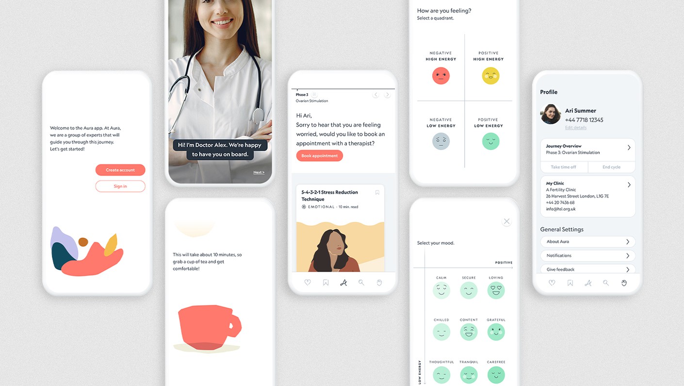
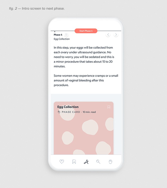
The app uses a simple timeline framework: by scrolling left and right, users can navigate the nine different phases and access the supportive content within each phase, including coping tools, recipes, articles, and checklists. Interaction with the Aura app is consistent every day, giving the user a sense of control and predictability throughout the complex process (figs. 1 and 2).
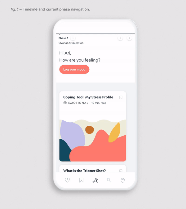
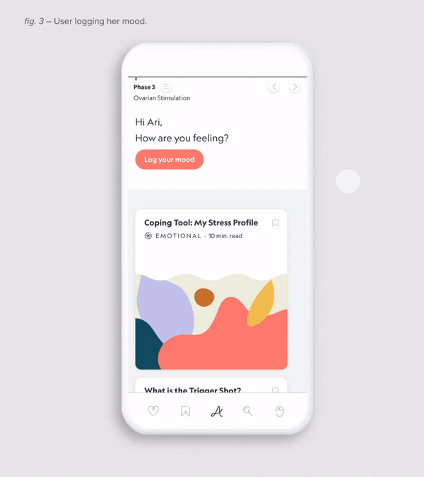
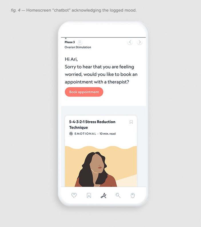
Every day, the app asks the user how they are feeling. The subtly integrated chatbot feels more like a conversation with a knowledgeable and supportive friend than a digital survey. To answer this question, a scientifically-backed, simple and visually engaging method guides you to log your mood(figs. 3 and 4).
Working with Special Projects has raised our perception of what's possible, and challenged us to stretch our ambition on UX to build a truly world-class platform. Their work ethic, empathy and attention to detail - as well as their ability to analyse and understand the problem - shaped our project and ultimately the product.
Abi Hannah, CEO of Aura Fertility
Four pieces of content are then suggested based on your emotional state.
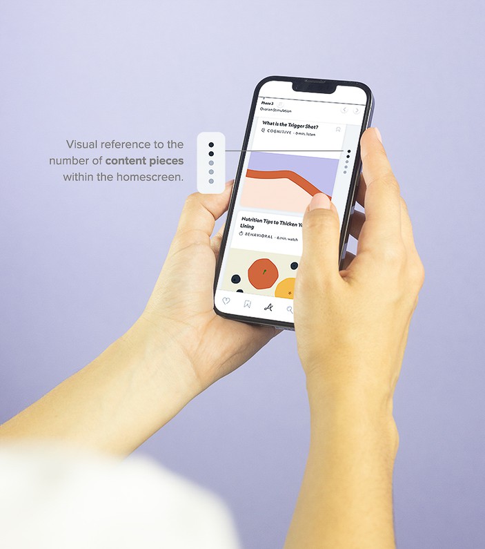
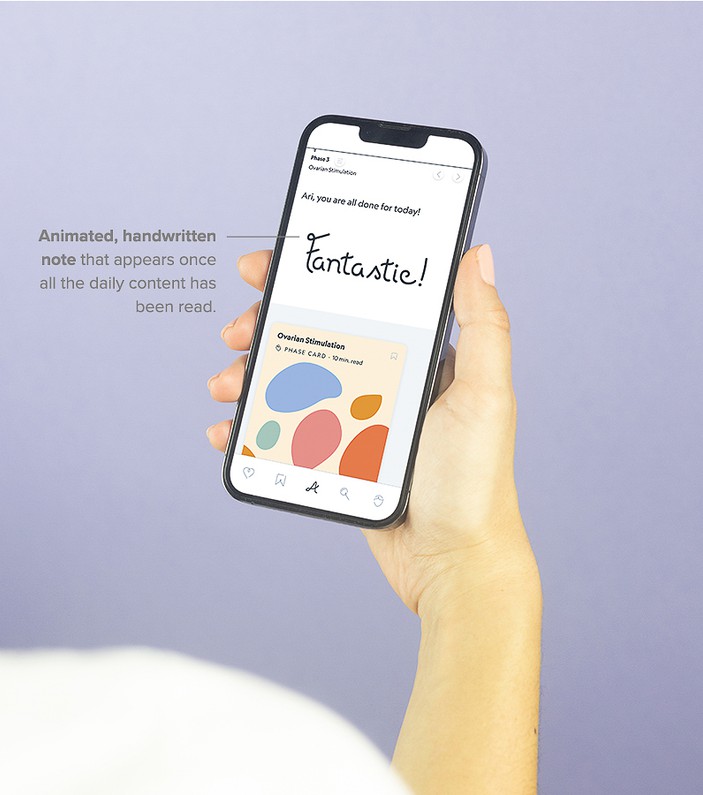
Only four daily pieces of content – alongside a fixed informational Phase Card – are suggested to avoid doom-scrolling and binge consumption, which are common when users are anxious. It simply prioritises content that is right for them at that time, without being overwhelming, demanding, or turning into an endless To Do List. Once the four pieces of content are read, a celebratory animation lets users know they have read enough for that day.
Only four daily pieces of content – alongside a fixed informational Phase Card – are suggested to avoid doom-scrolling and binge consumption, which are common when users are anxious. It simply prioritises content that is right for them at that time, without being overwhelming, demanding, or turning into an endless To Do List. Once the four pieces of content are read, a celebratory animation lets users know they have read enough for that day.
The feedback on what we've created has been exceptional from users, partners and investors alike.They [Special Projects] were patient, kind, and caring, genuinely nurturing our nascent product with love and helping it to grow! They have a discipline and creativity we have never experienced with other partners. They have a unique combination of skills that delivers both the 'brilliant basics' and the 'surprise and delight' elements for our customers.
Abi Hannah, CEO of Aura Fertility
The app is designed with the user’s emotional well-being at the front of mind. All app interfaces and interactions are designed to avoid emotionally triggering the user negatively: there is no mention of potential pregnancy, imagery of babies, or sperm/egg icons. We deliberately designed out anxiety-inducing pop-up notifications that might deliver bad news and used the chatbot interface as a conversational interaction instead.
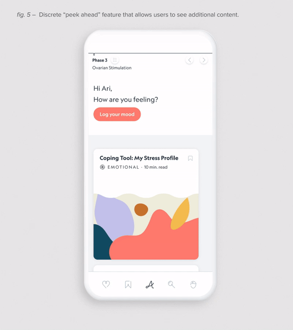
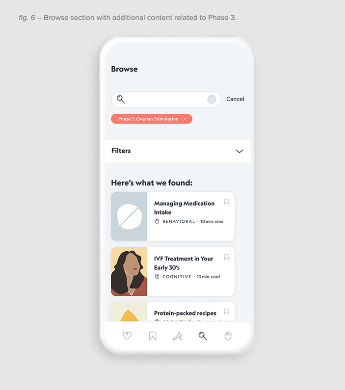
We also designed the interface to empower the user to take control: they are able to change between phases as needed in their circumstances, instead of using any standardized durations that make users feel like their bodies or progress is not normal. Users can also choose to explore more content using the ‘Peek Ahead’ feature to engage with content at their own pace (figs. 5 and 6).
We also designed the interface to empower the user to take control: they are able to change between phases as needed in their circumstances, instead of using any standardized durations that make users feel like their bodies or progress is not normal. Users can also choose to explore more content using the ‘Peek Ahead’ feature to engage with content at their own pace (figs. 5 and 6).
IVF treatments are beyond stressful. The Aura app counters with compassion.
Mark Wilson, Fast Company
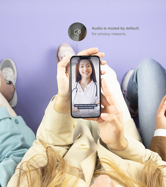
Fertility is a sensitive subject, so we designed the app to be mindful of the context of use. We avoided auto-play videos and audio that might share a secret unintentionally, and ensured the branding and graphics throughout are not suggestive or embarrassing.
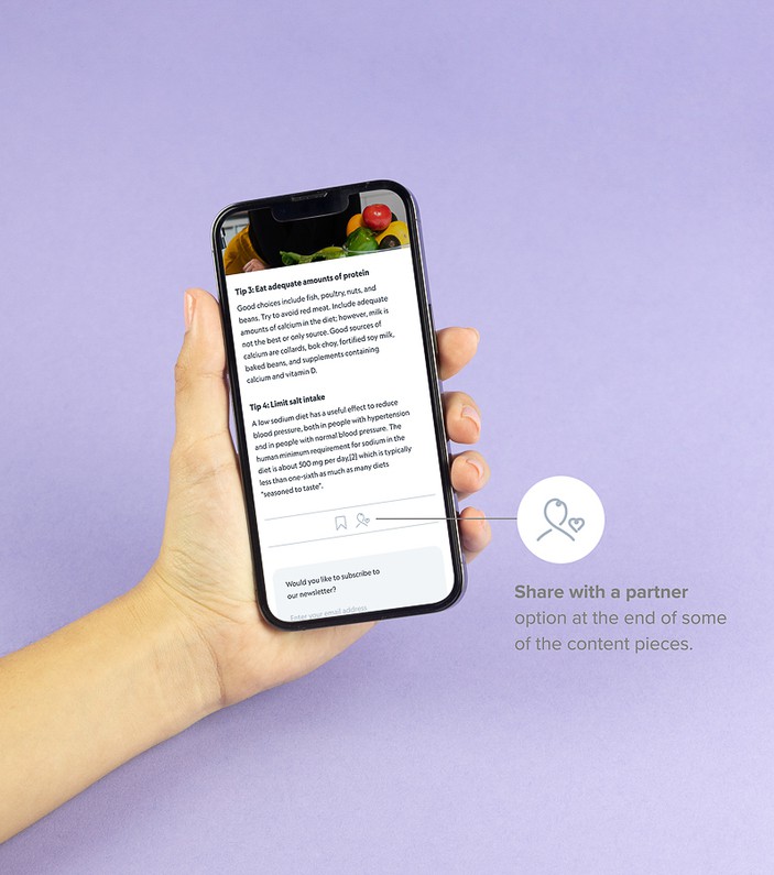
Our research highlighted the importance of being able to share this experience with a partner, family or friends. The app content is designed to be easily shareable so they can take part and support the user throughout all stages.
Our research highlighted the importance of being able to share this experience with a partner, family or friends. The app content is designed to be easily shareable so they can take part and support the user throughout all stages.
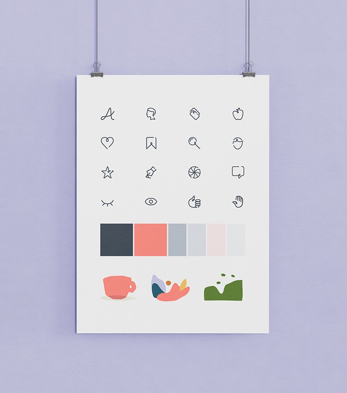
As part of the MVP App development, we helped Aura develop their brand strategy, including the logo, icons, colour palette and interface components.
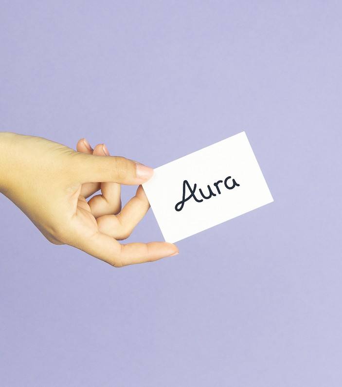
Aura is designed to feel like a companion, so a capital letter and handwritten logo communicate approachable, human qualities. A contemporary, trustworthy sans serif font compliments and balances the style.
All icons, UI elements, and custom illustrations are consistently designed to highlight the subtle human elements, giving the brand a unique character, and avoiding triggering imagery that many competitors resort to.
The app is designed to be scalable and evolve over time, with a future-proof roadmap of features that would truly elevate the app in the fertility market.
We created an app that thoughtfully puts the users’ emotional wellbeing at the centre of attention, while providing clarity and scientifically-backed support throughout the journey.
Special thanks to Stefano Giuliano for the project's images