Client
King’s College, NHS Foundation Trust
Year
2022
Brief
Design the user experience, app architecture and branding of an evidence-based digitally supported therapy for patients with psychosis.
Solution
An inclusive, approachable and context aware digitally supported therapy that is designed for all levels of engagement, technological literacy and dexterity.
Keywords
Strategy, health tech, digital product design, UI/UX, inclusive design, digital wellbeing
Packages
Imagine - Materialise
Press
—
Awards
SloMo
SloMo supports in-person sessions with a therapist by helping patients monitor and recall difficulties, understand cognitive behavioural therapy concepts and access therapy tools outside of the clinic room and in daily life. The project has just been awarded £1.3m in funding by Wellcome to allow it to be scaled up in three NHS Trusts.
We started our design journey understanding the specific needs and requirements of a very targeted audience. When developing the first version of SloMo, the King’s College London team found that a quarter of people with severe psychosis did not own a smartphone. In addition, some patients are heavily dependent on external help, having not left their home in a long time, and others are worried about being followed and tracked online as soon as any personal data is required. We were therefore highly aware of building a digital interface that would be as accessible, clear and as transparent as possible.
After some carefully crafted user interviews and exposure to the previous SlowMo experience, we understood how specific requirements were going to influence our design directions.
Our design development was based on the original version of the SloMo app, which was successfully tested with more than 350 participants. We were approached to design the user experience and strategy of both the app and the therapy web app, as well as rebrand the whole SlowMo identity. The outcome of this project resulted in a clickable prototype that will be further developed by the Wellcome funding for testing in three NHS Trusts, with a plan to scale up across the NHS in the next five years.
“A master class in inclusive design for anyone striving to create user-friendly yet playful interfaces”
Elissaveta M. Brandon, Fast Company
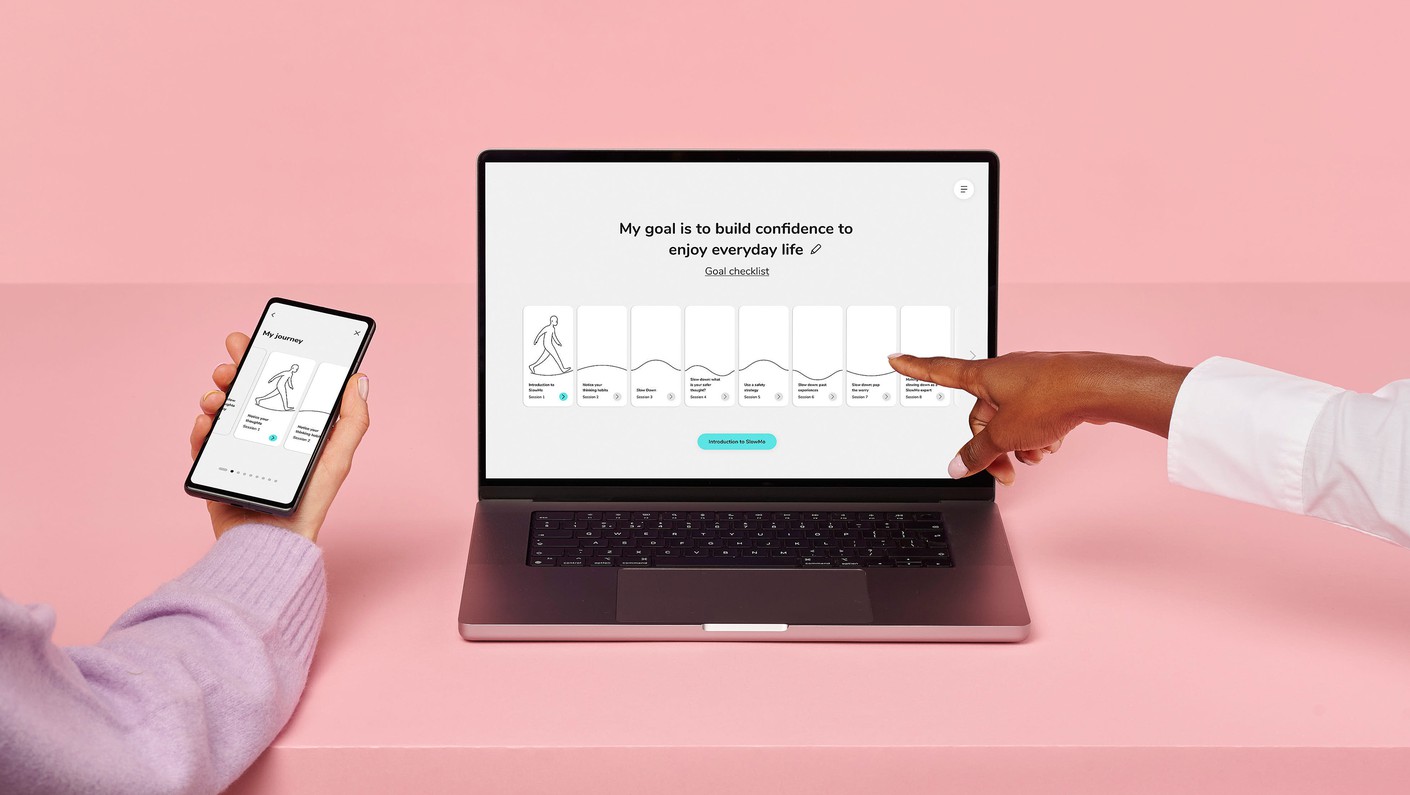
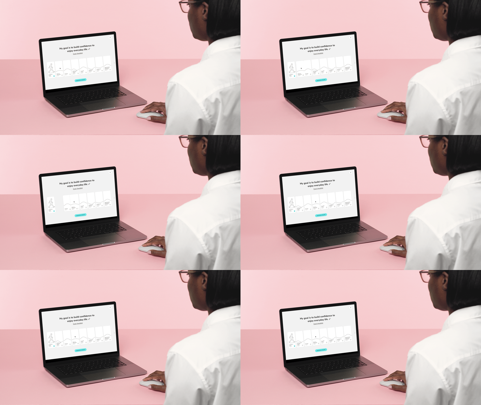
The SloMo therapy happens over the course of up to eleven in-person or remote sessions with a trained therapist. These sessions are guided by engaging SloMo content that includes educational videos, interactive activities and a roadmap that indicates progress over time. The therapist shows this content on a digital screen throughout the sessions, so it was important to design it to be supportive, rather than distracting. It was also designed with the context in mind; both therapist and patient had to be able to view the content at a distance, and interact with simple, clear and non-intrusive prompts.
Designed to be both useful in an emergency situation, as well as a useful resource throughout everyday life, patients can either use the ‘emergency’ function to slow down a worry, or access their toolkit - a collection of useful resources at their fingertips. Patients can also choose a personalised avatar, and set their own goal for how they hope the therapy will impact on their life, which is displayed front and centre above their journey every time they start a session.
“Inclusive human-centred design provides a novel way of harnessing therapy mechanisms - engagement, usability and enjoyment - that can lead to better outcomes. The collaboration with Special Projects has been invaluable in improving the user experience of SloMo for delivery in frontline services.”
Amy Hardy, Clinical Psychologist Lecturer and SloMo Co-founder
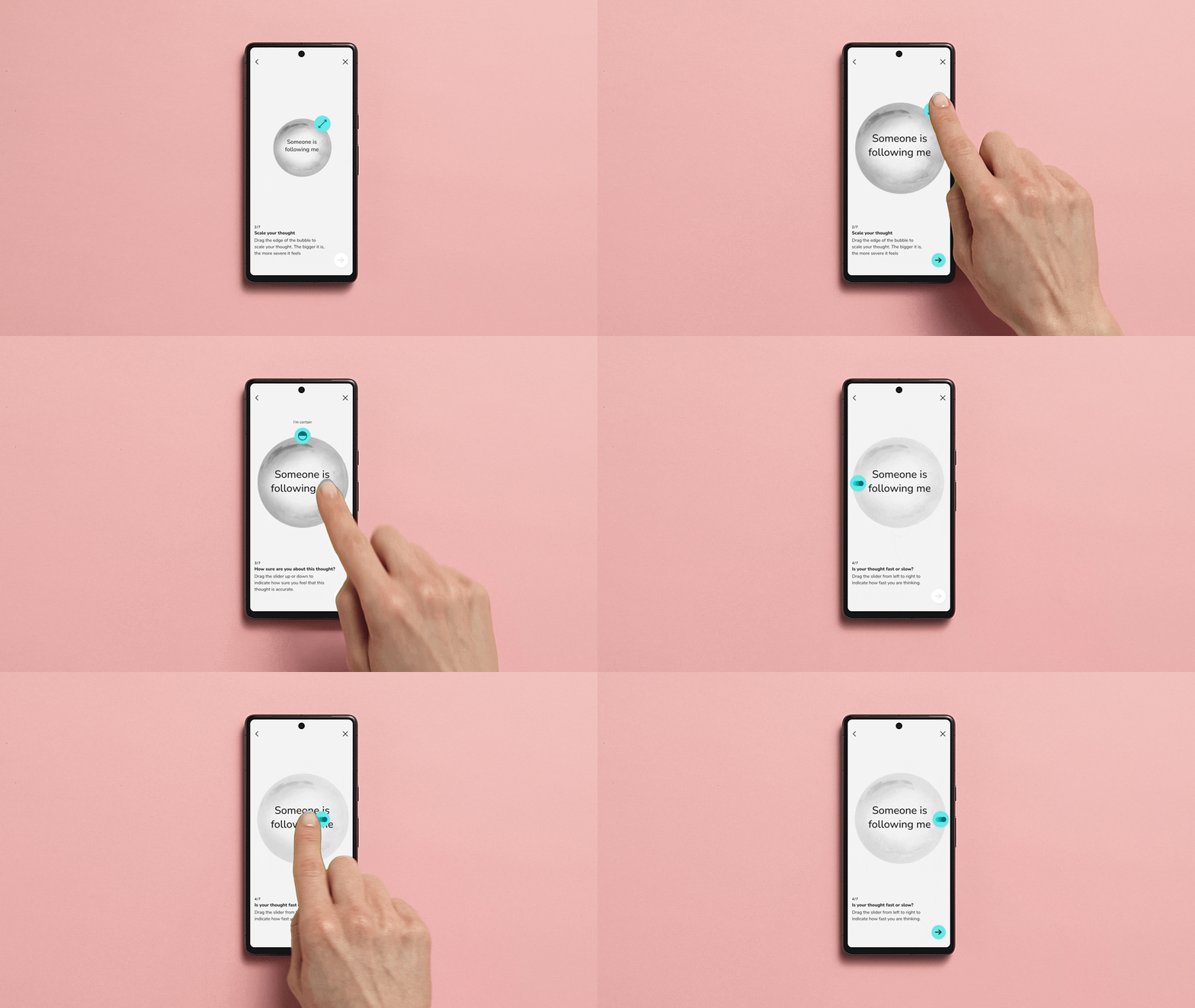
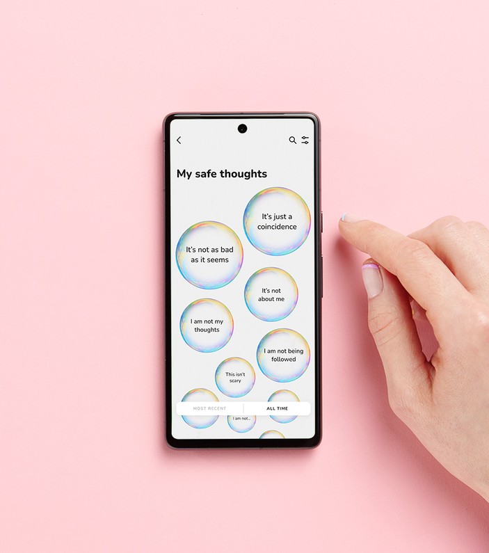
Throughout the SloMo therapy, patients’ thoughts are represented as bubbles. Worries appear in grey bubbles, while helpful, safer thoughts appear in coloured bubbles. These can vary depending on three factors; the size of the bubble indicates how severe the thought is; the opacity indicates how convinced the patient is that this thought is true; and the speed at which the bubble spins represents the thinking pattern of the thought, either fast or slow.
SloMo Bubbles can be manipulated using ‘bubble tools’ designed to be used by both therapist and patient on the web application and phone interfaces. The tools appear directly on the bubble to make the interactions intuitive for anyone. They are sized and placed to be inclusive for any level of dexterity and tech know-how. Designing these bubble tools was essential to the core interactions within the app and web app.

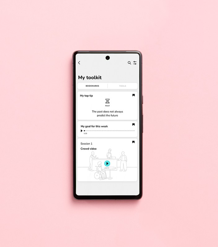
The app offers patients a toolbox full of useful resources. Elements from the live therapy sessions can be bookmarked to appear in the app, so patients can take the most useful content home with them.
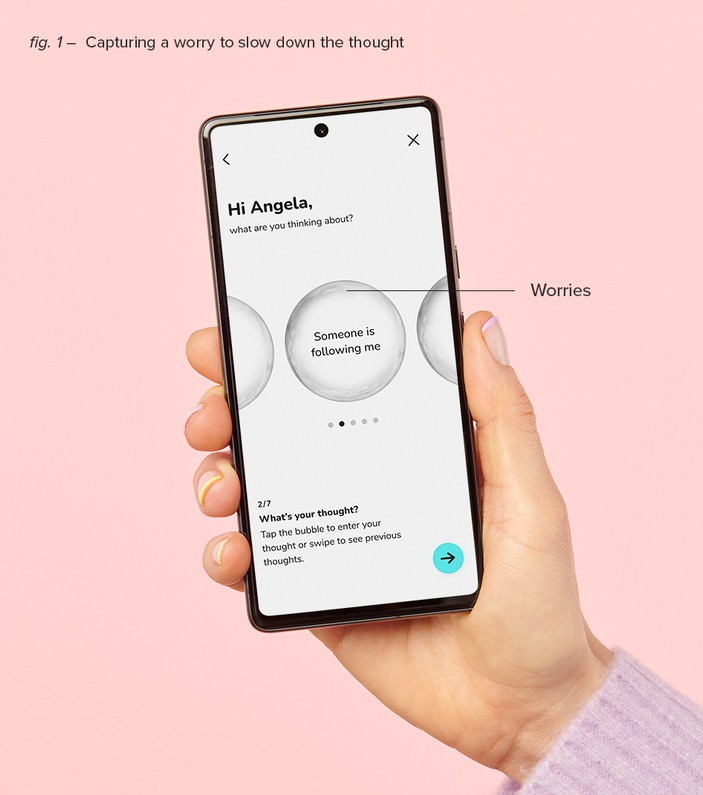
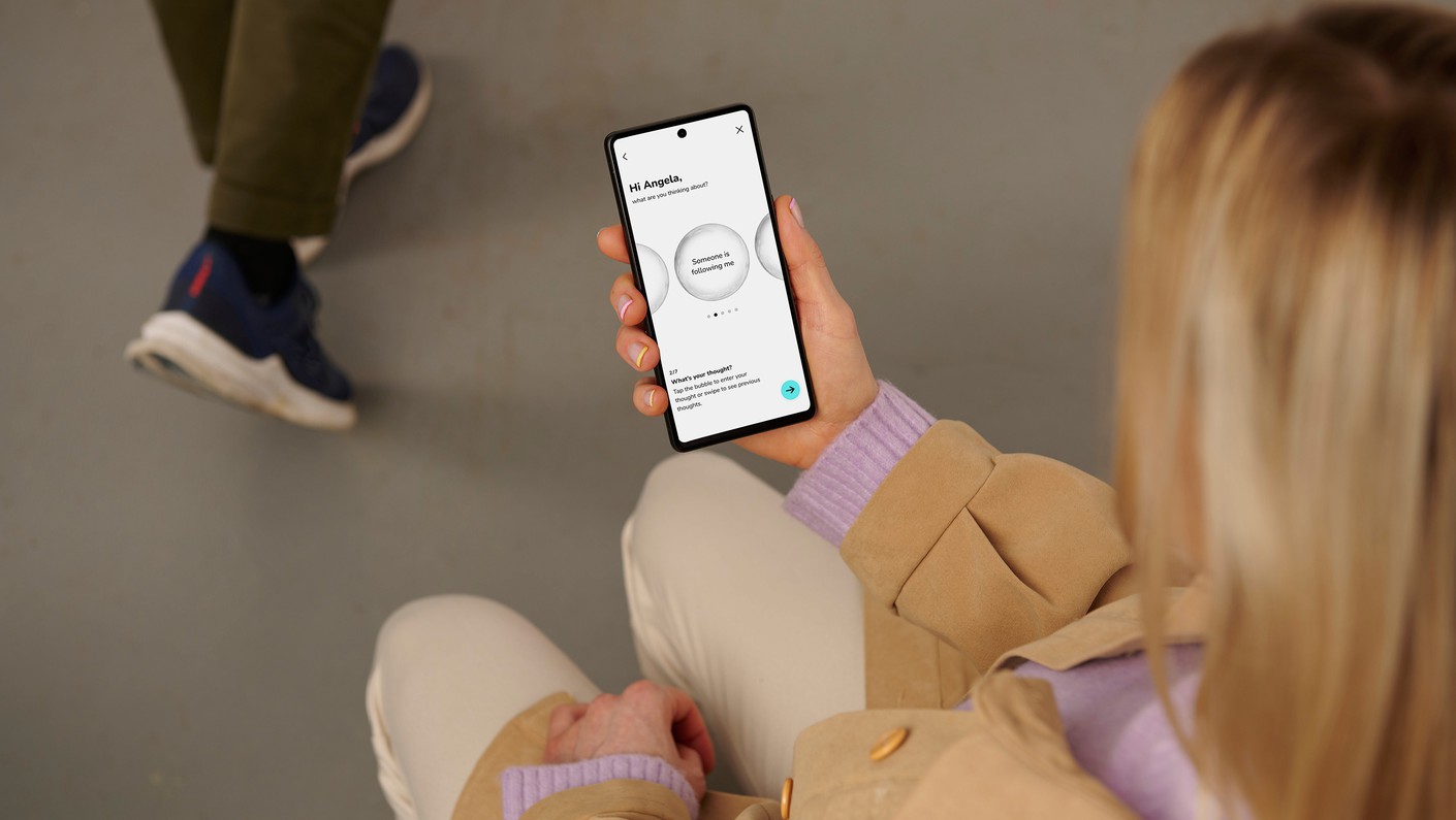
In an emergency, the app guides patients through an intuitive process of logging their upsetting thoughts, slowing them down by reflecting on what is really happening, giving them tips to review their thinking and reframe the thought.
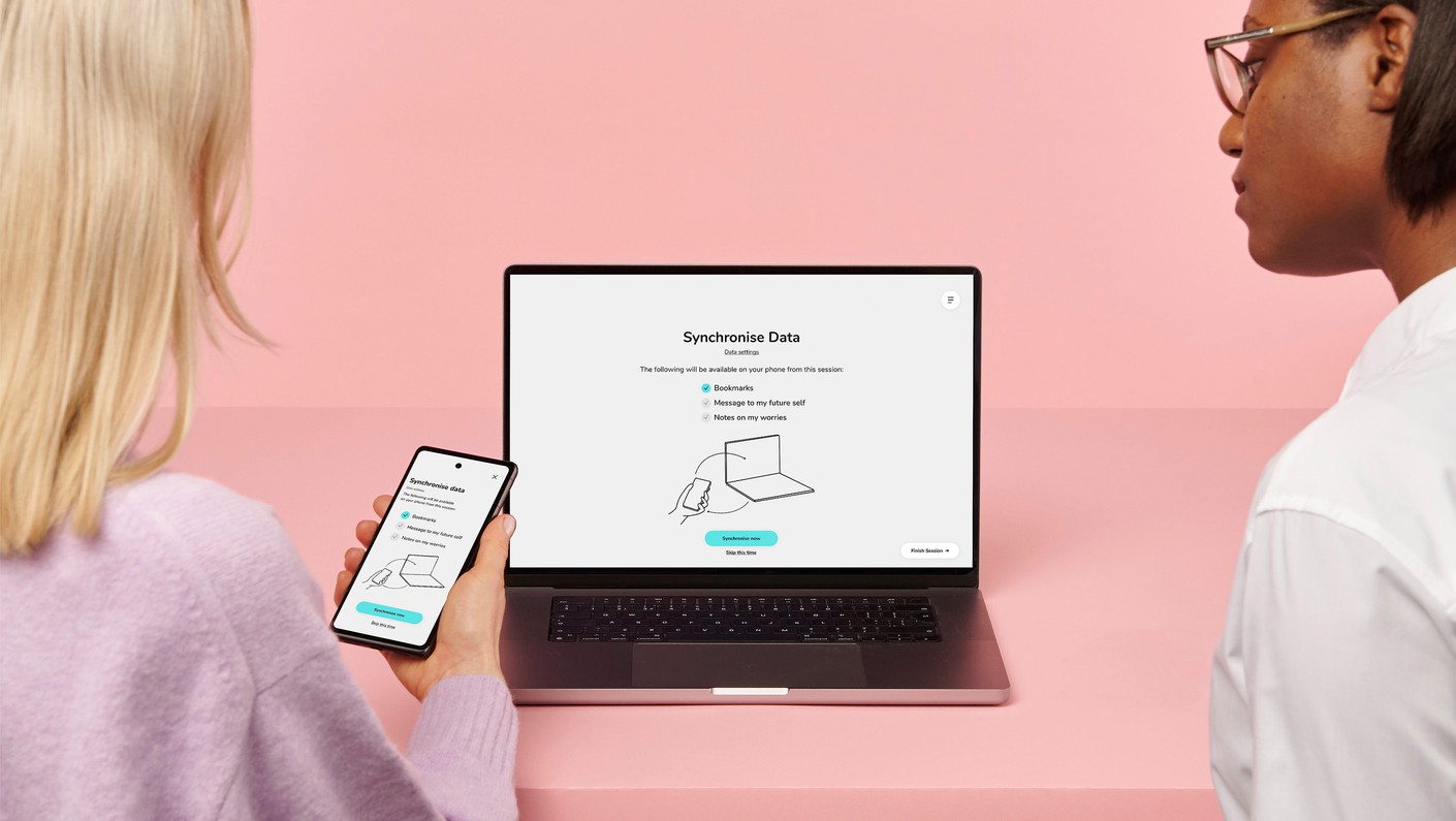
Another main consideration for the design development was the concern around privacy and data security. All personal content is stored locally on the patient’s device, so at the beginning of every therapy session the app is synched to the web app to update the therapist on new bubbles and progress. Similarly, at the end of every session, the app is synched again to ensure content matches across both platforms.
With the patients’ major privacy concerns, we have designed the app and web app to be highly transparent whenever data is transferred. The data transfer moment is always a conscious choice. The patient can choose exactly what they would like to share from a carousel. Similarly, they can also choose which elements they would like to keep to themselves by locking bubbles as they are created and removing them from the sync queue. Patients can also choose not to sync at all.
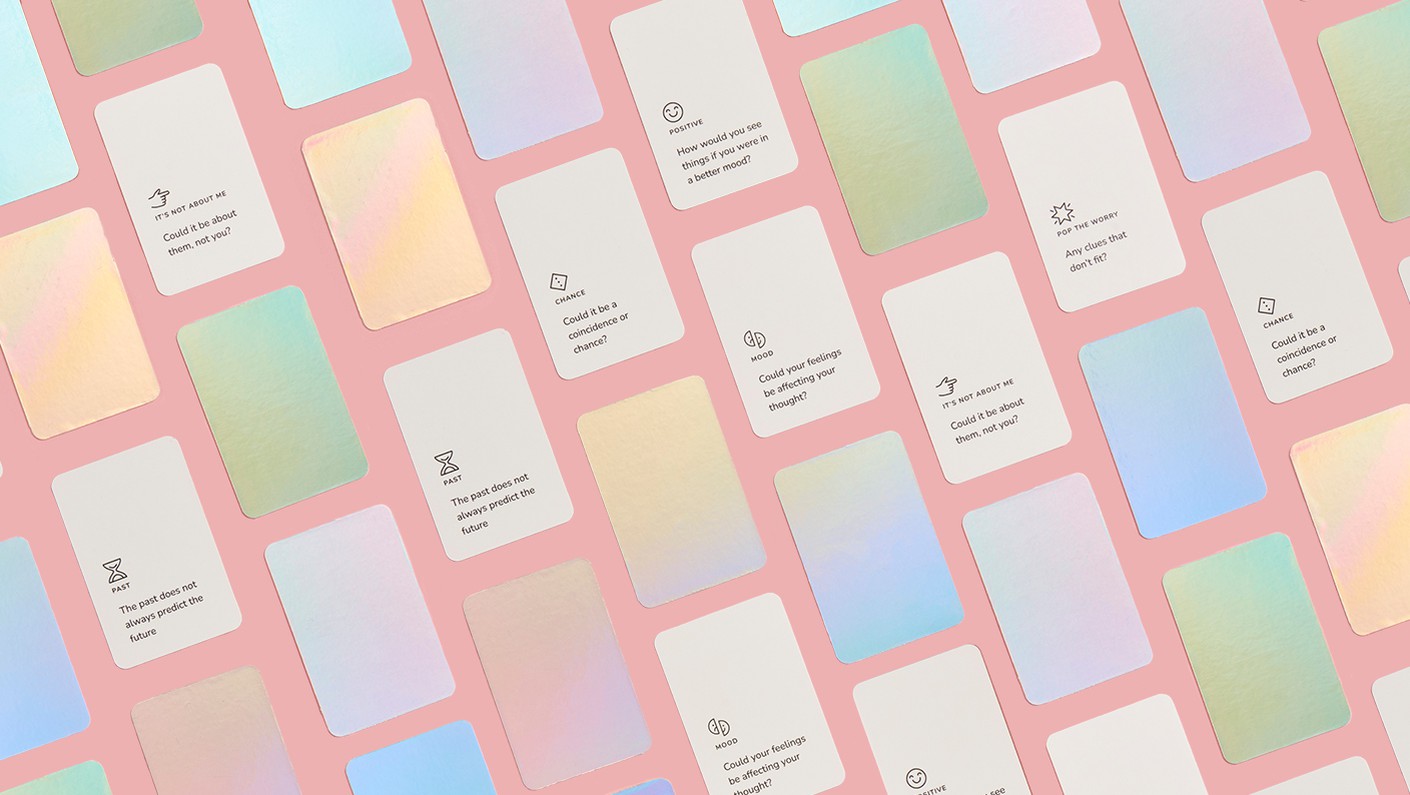
The ultimate goal of the SloMo therapy is for users to apply this process without the aid of any technology. To support the person's learning, we have created physical tip cards that match the digital form and offer an alternative to the app. Patients can keep these in their pockets to remind them how to reframe their thinking without needing to open the app.
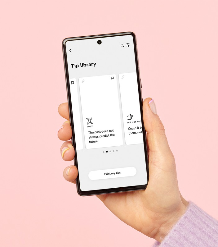

The SloMo branding was reimagined to create an accessible and trustworthy brand. It is based mainly on realistic 3D elements including the central bubble metaphor, supported by accessible and inclusive 2D illustrations.
The illustration style is based on the journey line, where everything connects to create a central narrative. It was essential for illustrations to be immediately recognisable, portraying real world scenarios and people, rather than abstract or imaginary concepts.
The app UI was developed to be simple, yet conversational, to evoke the feeling of speaking directly to your therapist and being supported by a friend. Despite the complex topic, the UI is designed to be intuitive and unintimidating.
Physical elements, including the tip cards and potentially some future merchandise bring the bubble metaphor to life using a playful holographic effect. We aimed to stay away from any clinical or negative associations, creating a brand that patients enjoy interacting with to build a nourishing habit, instead of an anxiety inducing chore.
JMIR Publication describing the unique Design Research Process of SlowMo developed at the Helen Hamlyn Centre for Design.
Special thanks to Cyrienne Buffet for the app illustrations and to Colin Ross for the project's photography.


