The making of a considerate App
In 1988, design hero Don Norman wrote in his book 'Design of Everyday Things' about the importance of good design and good interfaces to avoid human error. He taught us all how to create products, dials and handles that would design-out human error and human frustrations.
In 'The Humane Interface' published in 2000, Jef Raskin explained that: "An interface is humane if it is responsive to human needs and considerate of human frailties". And yet, 22 years later, I still see a lack of consideration in app design and a lot of frustrating interactions. Many product designers, and in particular app designers, don't seem to know about Norman and Raskin's theories. Too often they expect us to act as machines, in a repeatable, cold-blooded way. They are impolite, they make us feel annoyed, frustrated, or even wrong.
Politeness and considerate app behavior are even more important if an app is designed to act in the medical or wellness space. Imagine not feeling well and being assisted by an understanding, gentle nurse or instead finding yourself in the hands of a rigid, cold practitioner. Despite this clear parallel with real-life healthcare situations, many apps in the same space fail at communicating warmth, they fail at being polite.
By polite I don't mean addressing you with your title or using ceremonious rituals. By polite I mean "showing behavior that is respectful and considerate of people" [1].
The word behavior is intentional. So many apps now interact with us as if they were a human: they have names; they send us messages. Now it's time for them to become polite.
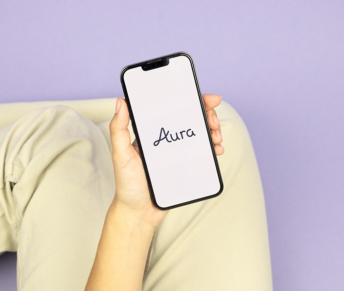
When we were approached by Aura to design an evidence-based support platform that offers pioneering whole-person care for people going through IVF, we knew we had to get that just right.
In Vitro Fertilisation (IVF) is one of several techniques available to help people with fertility problems have a baby. It’s often a hard, extremely demanding, and emotional journey. 90% of women undergoing IVF report anxiety, depression or stress, with 42% reporting suicidal thoughts [2]. Many IVF platforms out there are great at helping you to take your medicine regularly or keep track of multiple appointments but they fail to truly support you day to day.
[1] Definitions from Oxford Languages
[2] Fertility Network
At Special Projects, we’ve created four design principles inspired by essential human characteristics to make apps polite and considerate:
1. Don’t be too demanding
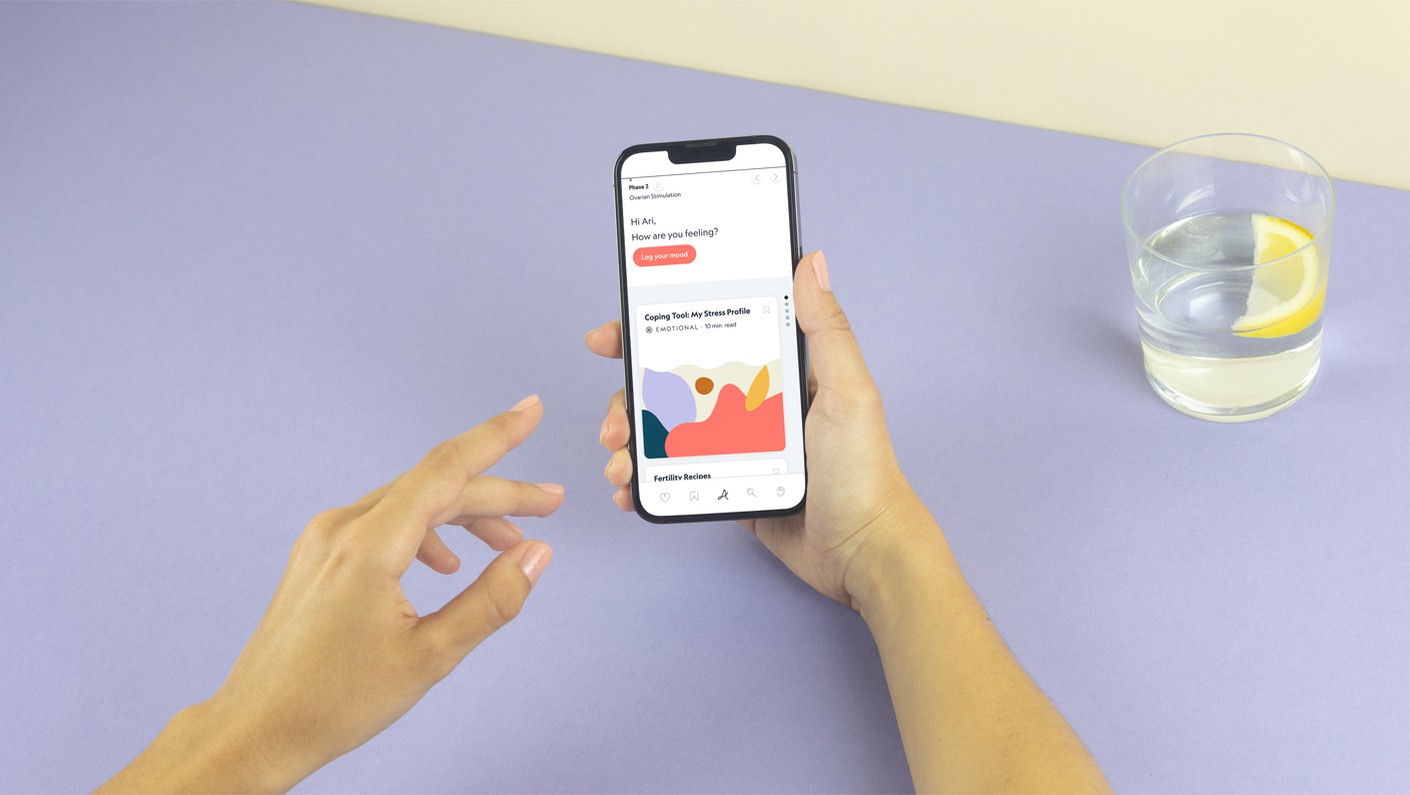
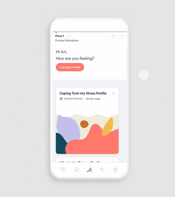
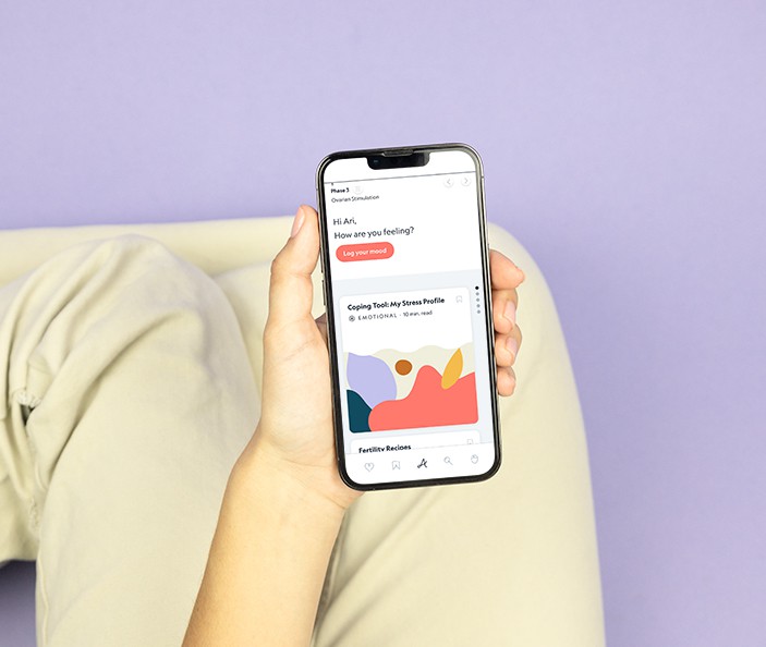
It’s tempting for apps to demand infinite attention and measure their success by calculating the time a person spends on them. That’s not respectful. We all know the negative consequences to our mental health of infinite scrolling and bingeing. To address this, we agreed with Aura that spending a few minutes a day in the app was the right amount of time and we designed accordingly. The user finds four fresh pieces of content every day on their homepage. Once they have read, watched, or listened to them, their commitment is celebrated with an animation and the page clears. Their work for the day is done.
Imagine a demanding person that wants you to look at them constantly and calls out for your attention repeatedly versus someone that you see infrequently but offers you great support and quality time every time you meet. The choice is easy.
When designing an app, asking the right questions is key and these would be:
‘What is the right amount of time and energy for the user to spend on your digital product to get the most out of it? What would help them? How can we give the most support in the shortest amount of time?’ as opposed to ‘How can we maximise the time a user spends on our platform, or how could we get them back as many times as possible?’
2. Be caring
What is on your user's mind right now? How can your app offer comfort and support?
Our research revealed that people going through an unexpected and unpredictable journey such as IVF find predictability and control helpful. By offering a predictable number of content pieces per day, we provided users with a sense of control.
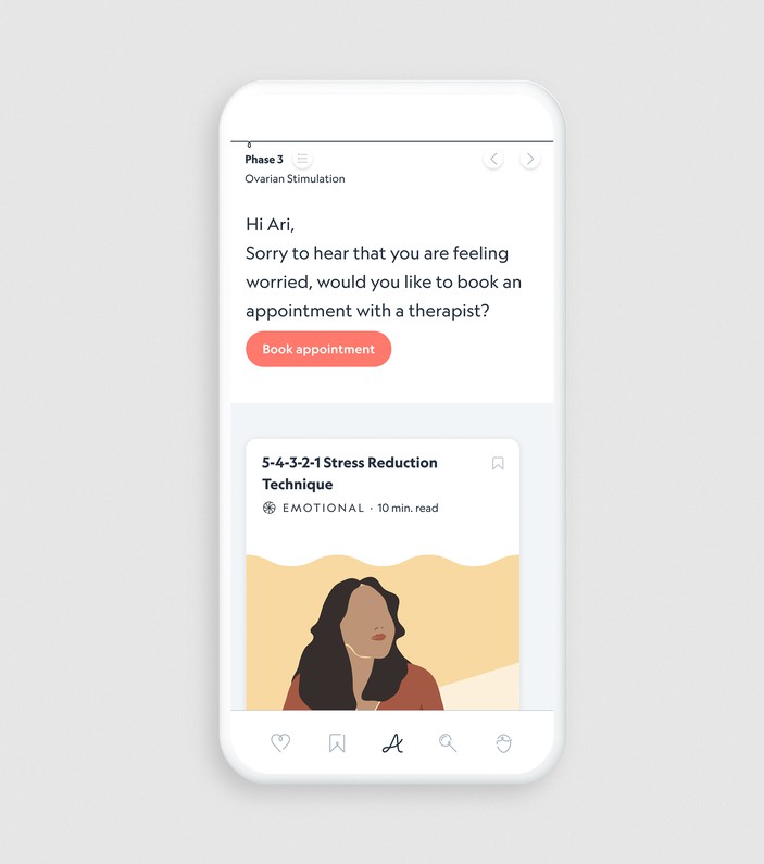
Aura asks their users daily how they are feeling. This helps the content to be tailored to the mood of the user but it also establishes trust between the platform and the user, who feels listened to. The conversation starts in a human way, by checking in.
The whole app-human relationship is designed to be very respectful. We avoided using triggering imagery and wording that might make the user feel wrong or sad. We structured the whole app to not be about success or failure, but about supporting the user on their journey, whatever shapes it takes. We avoided structures associated with a “to do list” to remove feelings of duty and stress which can kick into guilt and remorse.
Jo Living, Co-founder & COO of Aura says “Fertility treatment can leave people feeling isolated and dehumanised. At Aura, being human was a core value we wanted to come across through the app. A ‘human app’ is of course an oxymoron. However, Special Projects were able to combine unique design principles with the care, love and attention they injected to really personalise and humanise the app experience for our users.”
It’s tempting for apps to demand infinite attention and measure their success by calculating the time a person spends on them. That’s not respectful. We all know the negative consequences to our mental health of infinite scrolling and bingeing. To address this, we agreed with Aura that spending a few minutes a day in the app was the right amount of time and we designed accordingly. The user finds four fresh pieces of content every day on their homepage. Once they have read, watched, or listened to them, their commitment is celebrated with an animation and the page clears. Their work for the day is done.
Imagine a demanding person that wants you to look at them constantly and calls out for your attention repeatedly versus someone that you see infrequently but offers you great support and quality time every time you meet. The choice is easy.
When designing an app, asking the right questions is key and these would be:
‘What is the right amount of time and energy for the user to spend on your digital product to get the most out of it? What would help them? How can we give the most support in the shortest amount of time?’ as opposed to ‘How can we maximise the time a user spends on our platform, or how could we get them back as many times as possible?’
What is on your user's mind right now? How can your app offer comfort and support?
Our research revealed that people going through an unexpected and unpredictable journey such as IVF find predictability and control helpful. By offering a predictable number of content pieces per day, we provided users with a sense of control.
Aura asks their users daily how they are feeling. This helps the content to be tailored to the mood of the user but it also establishes trust between the platform and the user, who feels listened to. The conversation starts in a human way, by checking in.
The whole app-human relationship is designed to be very respectful. We avoided using triggering imagery and wording that might make the user feel wrong or sad. We structured the whole app to not be about success or failure, but about supporting the user on their journey, whatever shapes it takes. We avoided structures associated with a “to do list” to remove feelings of duty and stress which can kick into guilt and remorse.
Jo Living, Co-founder & COO of Aura says “Fertility treatment can leave people feeling isolated and dehumanised. At Aura, being human was a core value we wanted to come across through the app. A ‘human app’ is of course an oxymoron. However, Special Projects were able to combine unique design principles with the care, love and attention they injected to really personalise and humanise the app experience for our users.”
Remember the wonderful feeling of something being explained clearly by someone and finally getting it?
For an app to be considerate we need to design-out complexity. We need to use a familiar mental model, a structure that the user knows already to explain and order something new and otherwise confusing.
With Aura we created a simple timeline at the top of the screen to organise content. The IVF journey is a linear process, it has multiple stages and multiple exit points if the procedure is not working. The timeline helped us clearly communicate the structure of the journey to the user and distribute information accordingly to allow for orientation and familiarisation and to avoid feelings of overwhelm. Instead of being presented with an overwhelming amount of information, the user will see only what is relevant on that day, and will be able to easily access past content scrolling to the left, and even look into the future by scrolling right to quickly see what the next steps will be.
This is often the most neglected aspect.
We often find it surprising how little consideration goes into the physical context the user will be in when using a digital product. For example, think about map apps - you could be in a hurry, be scared, be exploring leisurely or it could be raining all over the phone screen - acknowledging these scenarios could lead to some really wonderful design opportunities. When designing and developing an app it’s easy to forget the multitude of scenarios an app will be used in and should be able to cater for.
Imagine a person that talks loudly in a cinema. Immediate hate, right? Some apps or digital objects are just like that. Think about the infinite beeping of a needy washing machine, the blinking led light of your electric toothbrush charger that transforms your room into a bad disco when you are trying to sleep, as well as the apps that notify you about something totally superficial while you are finally focused on your work or having some family time. Arghhhh!
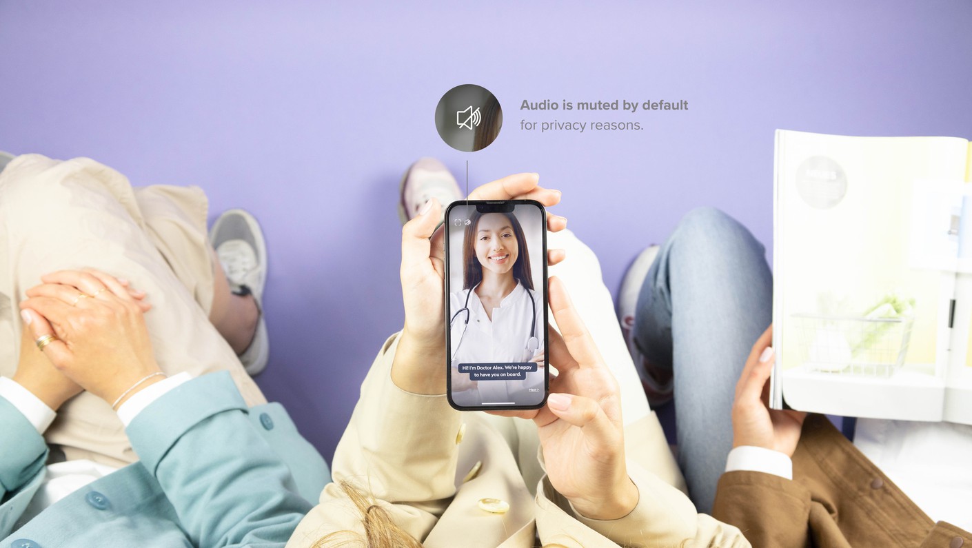
Apps are used by humans in the real world. Let’s make sure we design for that. Simple things can take us a long way. In the onboarding process for Aura, and in the content posts, we made the video play silently by default and added subtitles, so you won’t blast your Clinic Welcome message to the other passengers on the bus on your way home.
Optimising design for efficiency is simple because it is quantifiable, but optimising design for emotions is trickier. Those who get this balance right and enhance the unquantifiable aspects of life: empathy, wellbeing, delight, can create truly enriching experiences and products.
More articles


22.11.21
25.05.22