Client
Special Projects & Bristol University
Year
2024
Brief
Promote more sustainable food choices
Solution
Printed and digital interface experiments that encourage behaviour change
Keywords
Sustainability, strategy, packaging, digital / physical, experimental
Packages
Imagine - Materialise
Press
Eco Lenses
At Special Projects we are led by our guiding principles to explore how we can create sustainable user experiences that help people make better choices for themselves and the planet.
According to the Food and Agriculture Organization of the United Nations (FAO), the food sector is responsible for about 30% of global greenhouse gas emissions. We set out to explore how we could positively impact users’ food choices on a daily basis. Whilst the majority of people think it is important to buy food that has a low environmental impact, less than half consider their personal diet to be environmentally sustainable (source).
In this project we focused on six scenarios where users choose which food to eat: at a cafe, a restaurant, a fast food chain, ordering take away and two types of online grocery shopping. We designed experiments around physical and digital touchpoints and created interventions that bring delight and convenience to create seamless experiences.
We set out to help users make more sustainable and informed choices by design.
"The project is a masterclass in behavioral design"
Fast Company
How might we make sustainable choices at a cafe?
We collaborated with the
We applied our expertise and methodology to help create a design which led to 55% of participants responding that the eco-labels positively impacted their decision-making and raised their awareness. Further trials are due to be carried out this spring.
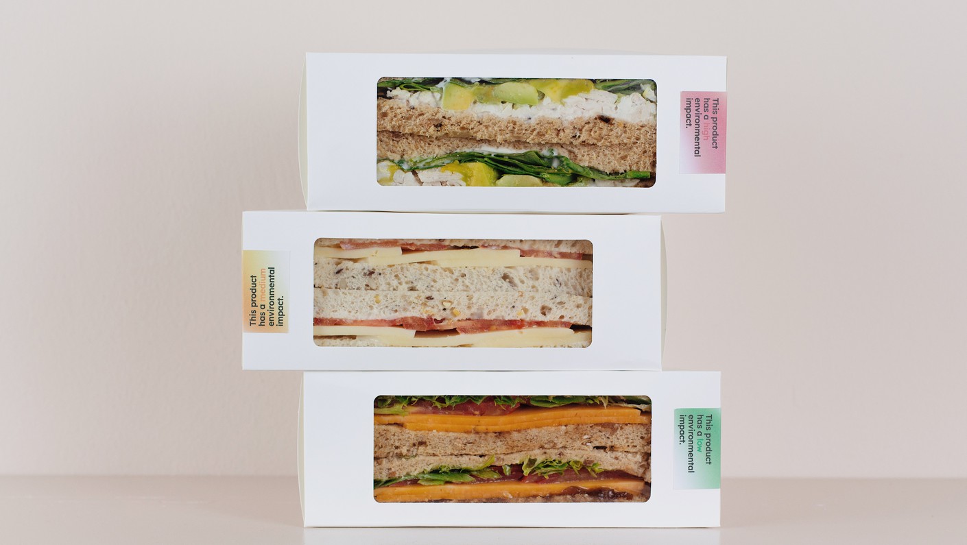
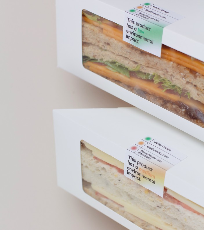
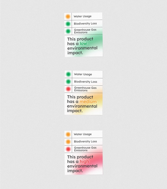
The study took place in four cafés across the University of Bristol campus. The packaging of the three most popular sandwiches were re-designed to feature three eco-labels, showing low, medium and high environmental impact. These categories were based on the studies research criteria and took water usage, biodiversity loss, and greenhouse gas emissions into account.
The label introduces a simple, universally recognisable traffic light colour system to highlight the sustainability impact from afar. On the side of the label the red, yellow and green indicators further detail the sandwiches’ impact across selected sustainability metrics. At a glance users can see the impact of their choice, and delve into further detail if they want to engage further.
The gradient treatment introduces a softer nudge to influence behaviours, and steers away from the often offputting warning symbols, sustainability jargon and guilt imposing messaging.
Whilst we did not have influence over the type of information on the label, we designed with a non-judgemental approach that balances sustainability credentials with visuals that enable swift, simple decision-making.
"Good design isn’t just about the aesthetics but its ability to draw people in and engage them. It can make the user-experience more enjoyable and therefore persuade someone to continue using it"
Marcus Munafó, Professor of Biological Psychology at the University of Bristol's School of Psychological Science
How might we make sustainable choices at a restaurant?
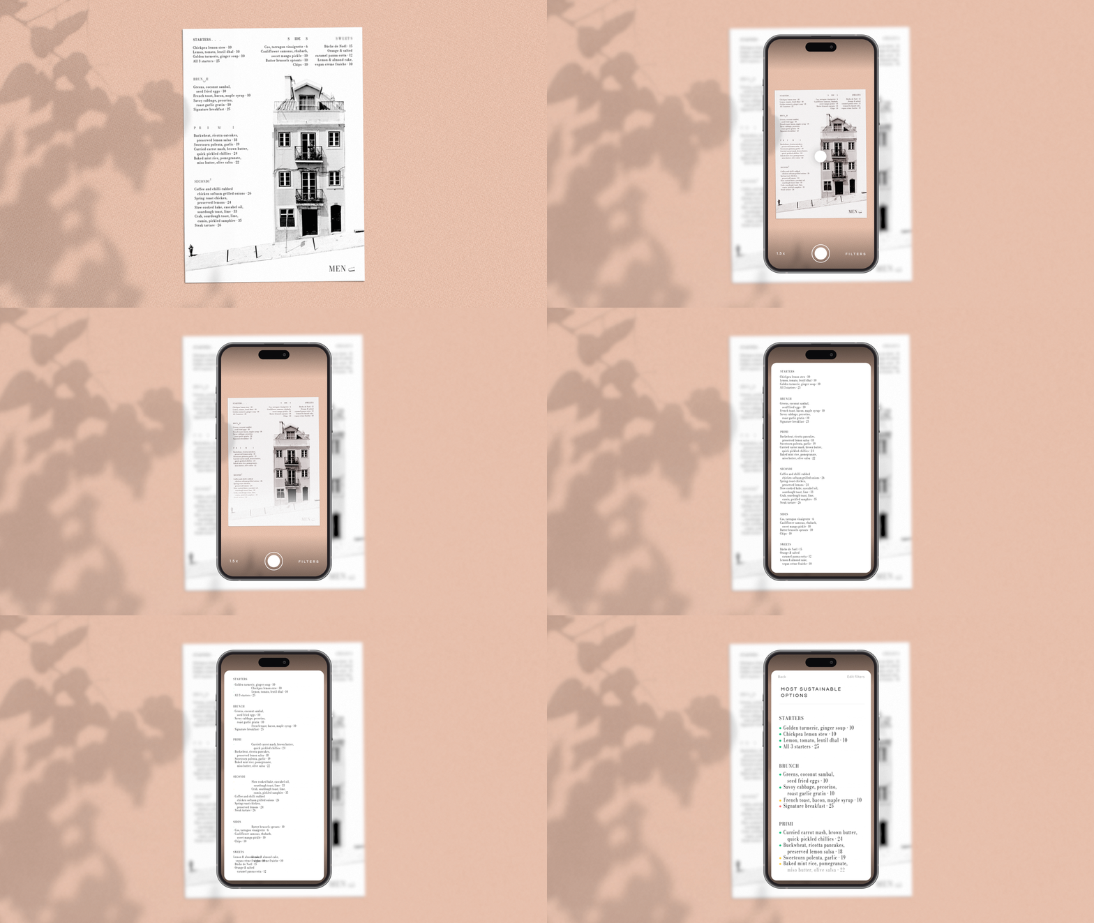
Simply take a picture of the menu, and with the power of image recognition and sustainability data at hand, the menu magically rearranges to bring more sustainable choices to the top.
Each dish receives a traffic-light sustainability rating, just tap on any item to find out more to make informed decisions about your next meal.
The app works with any restaurant menu and adjusts the size for easy and accessible viewing on your phone.
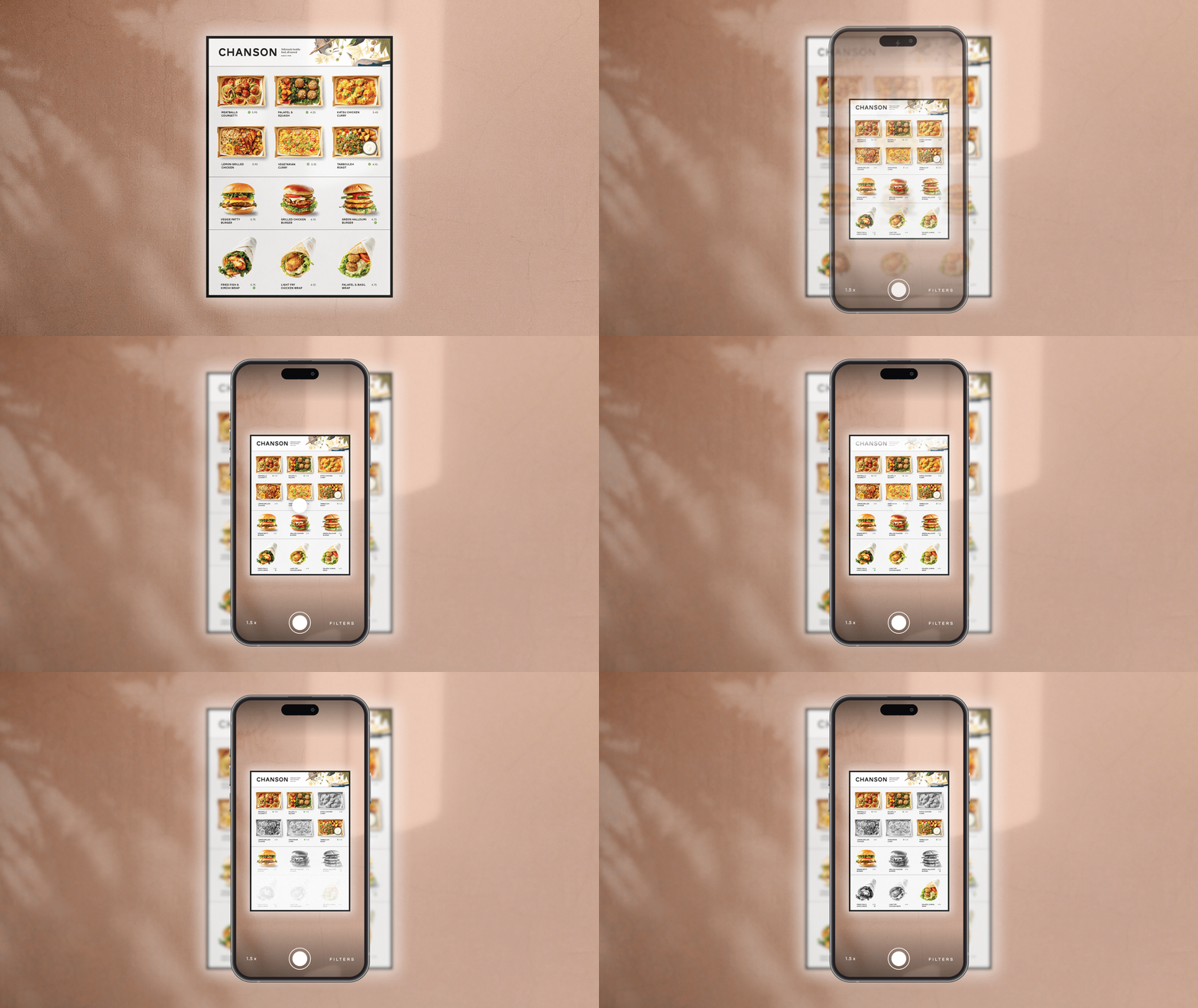
How might we find the best options at a fast food chain?
Scan the menu poster with your phone at the counter. Instantly, the eco-friendly choices will light up, and the rest will fade to black and white.
Designed for ease and speed, this delightful yet simple interaction helps you make quick decisions and takes the guesswork out of sustainable choices.
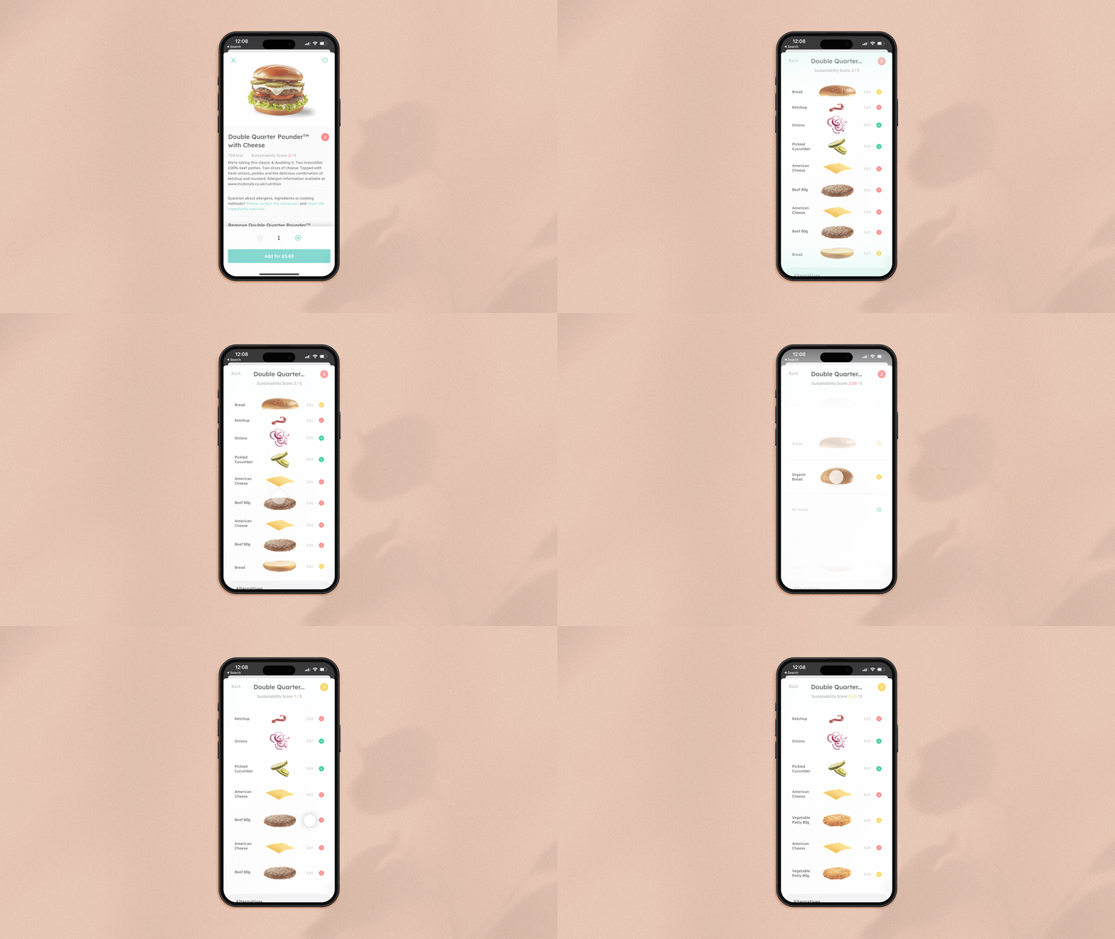
How might we feel more in control when ordering food online?
The use of food delivery apps, including Deliveroo and UberEats, has increased by 55% since 2015, with 25 million adults in the UK using them regularly (source). This concept enables users to make more sustainable choices as a way to balance the environmental impact of their order.
Let’s order a burger on a delivery app. The overarching sustainability score at the top of the screen gives an indication of the environmental impact of the meal.
Tap on it to reveal an exploded view of each ingredient and its associated score. You can change specific ingredients to make your meal more eco-friendly or explore more sustainable choices listed at the end.
This transparent method empowers users with the knowledge and means to make conscious decisions.
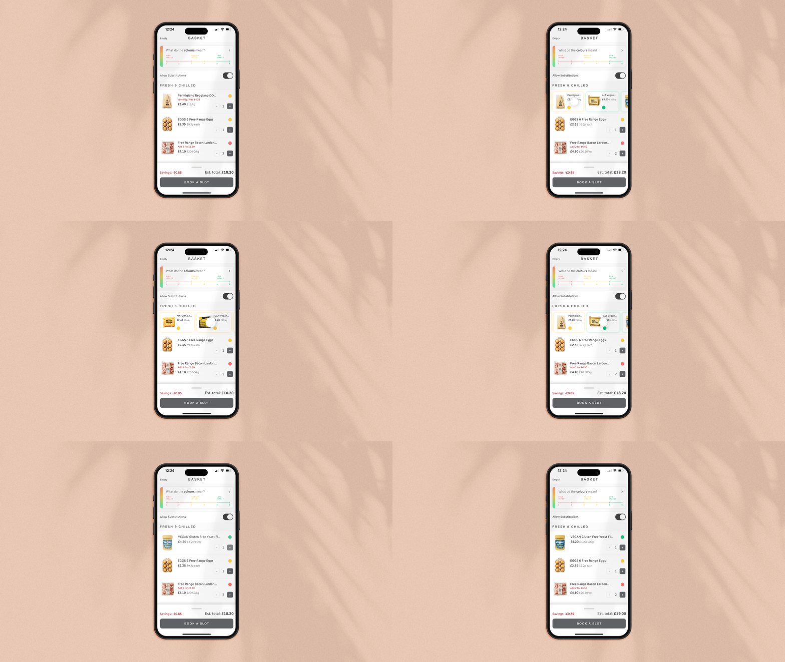
How might we feel more in control when shopping for groceries online?
When shopping at a supermarket it is easy to compare multiple products on one shelf to find the best option.
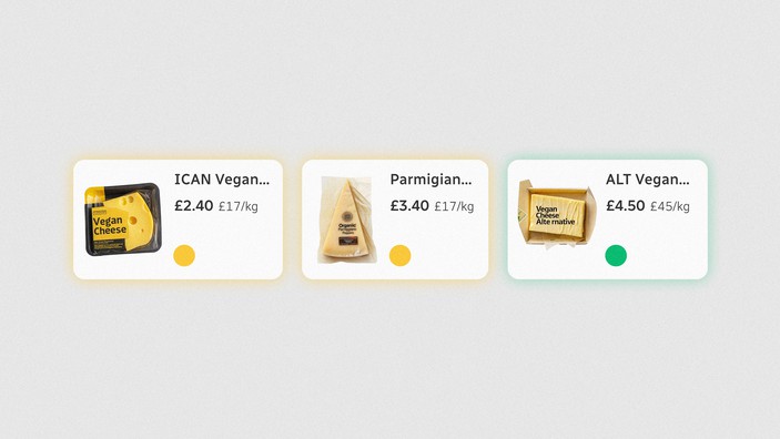
However, whilst online shopping is easy and convenient, price becomes the main comparison factor between products. Applying the same metrics as above, we came up with this concept to encourage more balanced decision-making based on sustainability credentials.
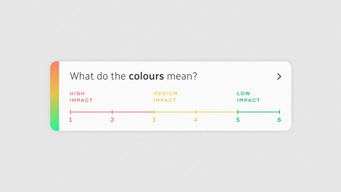
All items in the basket have a red, yellow or green sustainability score to help you see the environmental impact of your choices.
The impact scale at the top of the screen defines each colour. Simply tap on the score of each item in your basket to reveal more sustainable alternatives; swiping right towards the green end of the scale shows the most sustainably ranked products on offer.
This scoring system offers a quick look at your choices' impact, and swiping to explore alternatives makes it easy to shop greener with minimal hassle.
How might we make our cooking plans more sustainable?
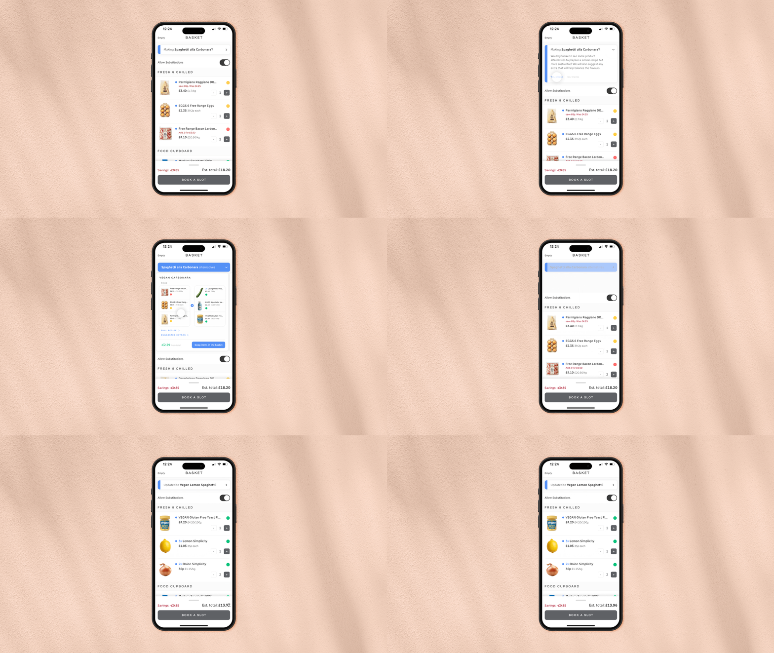
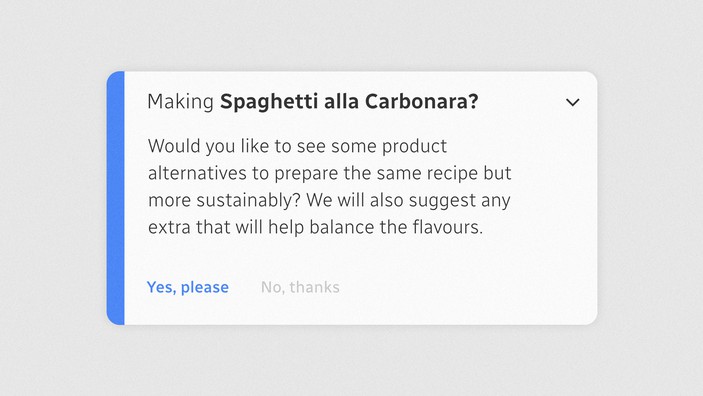
As an alternative approach, we use the power of AI to smartly recognise what the user is cooking based on the ingredients in their basket.
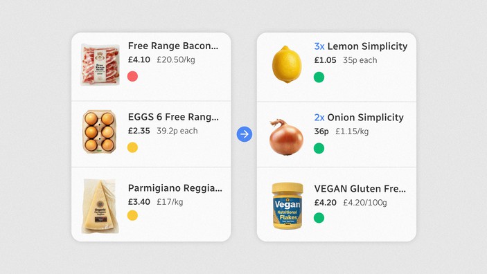
In this case, they are cooking Spaghetti alla Carbonara. Based on the ingredients, the app suggests a few similar, yet more sustainable alternatives. Users can choose between a vegan option, or be inspired by a Lemon Spaghetti recipe. With a simple tap, the ingredients are swapped out for more sustainable alternatives and the score is updated. There is also an opportunity here for supermarkets to factor in the cost of living crisis by proposing sustainable alternatives that are also more cost-effective.
Led by our guiding principles (see here) our goal was to create delight and wonder in positive climate choices, making sustainable options joyful as well as better for the future of humankind. We improved the user experience, making these choices convenient, and not compromising across digital and physical touchpoints.
You can find all the concept videos here.


