Client
Special Projects
Year
2021
Problem
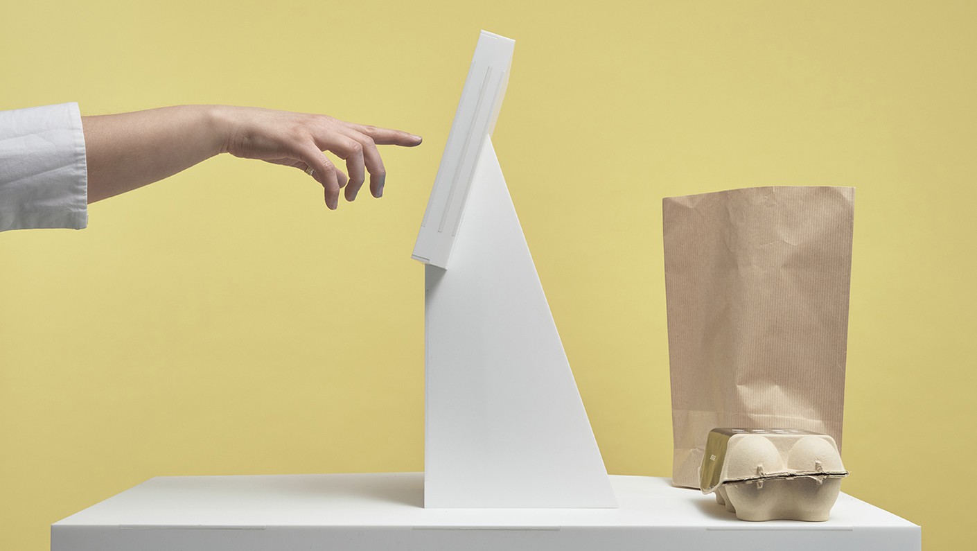
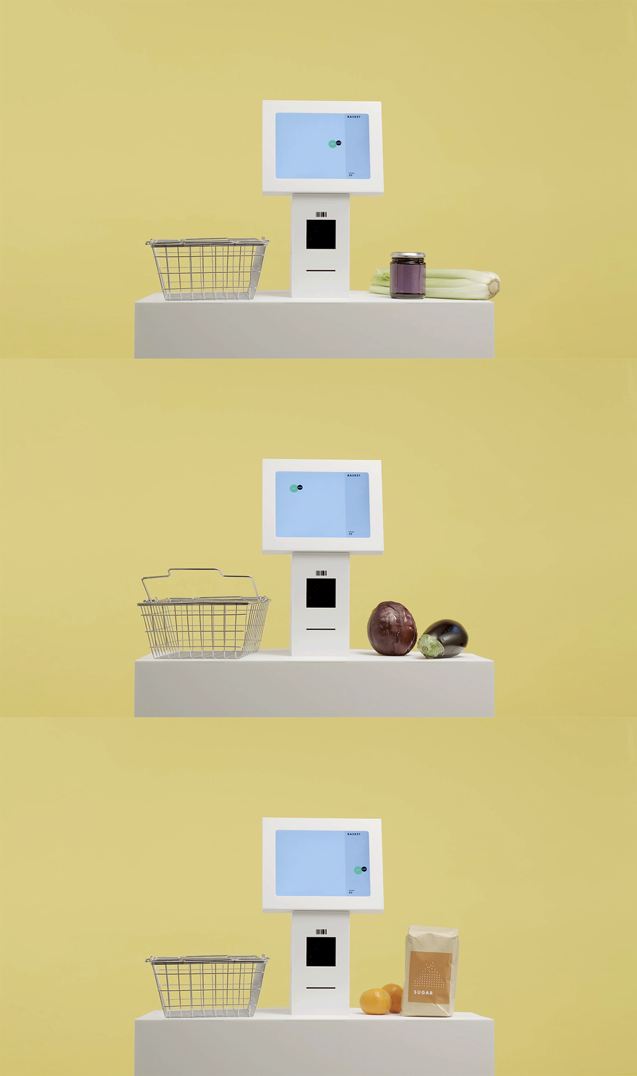
Many digital kiosks require customers to press on the same area of the screen as someone else, spreading the risk of infection with Covid-19.
Solution
We invented an interface that responsively adapts to every user by shifting the buttons to a clean, untouched area of the screen.
Keywords
UX, UI, Magical Interactions, Covid-19
Press
Fast Company, Charged, Design Week, AXIS Web Magazine, Transform Magazine, Eminetra, Kiosk Marketplace, RetailWit, LS:N Global, Internet Retailing, Liberty Times Net
—
Awards
2021 Fast Company Innovation by Design Award, Experimental Category Finalist
Related Projects
Download
Moving Buttons
The COVID-19 pandemic has resulted in many changes in how we interact with our physical environment. During everyday routines such as grocery shopping, we try to minimize the risk of infection by wearing a mask, washing our hands and keeping a safe distance.
Like most design agencies we’ve been thinking about ways of reducing the spread of infection and were surprised at how many digital kiosks require customers to press on the same area of the screen as someone else. We estimate that a busy supermarket may have up to 30 customers per hour touching the same buttons on a screen.
This is difficult to avoid on physical buttons, such as those in lifts, however digital interfaces offer the opportunity to create dynamic buttons which can adapt and move about on the screen.
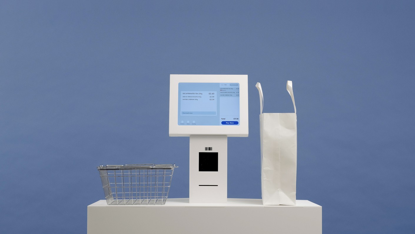
To tackle this we invented an interface that responsively adapts to every user by shifting the buttons to a clean, untouched area of the screen.
Simply brilliant. Special Projects have that rare gift of coming up with those “just right” solutions that are so elusive yet seem obvious with hindsight. Ideas like this are a reminder that things could be so much better if we just gave things a bit more thought and a sprinkling of magic!
Ben Griffin
Innovation Lead, Innovate UK
Innovation Lead, Innovate UK
"Moving Buttons feels like the perfect shared interface for a cleaner future."
Mark Wilson
Fast Company
Fast Company
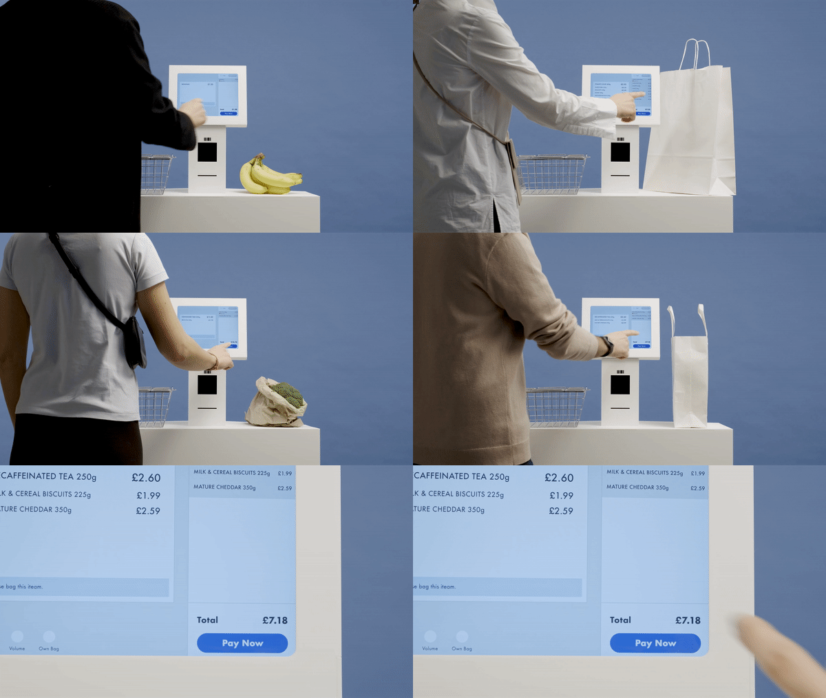
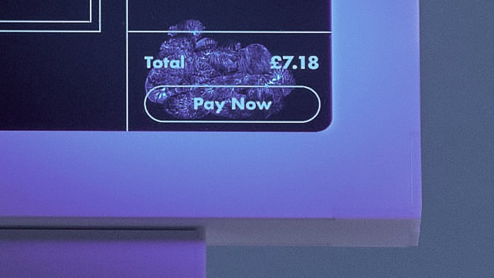
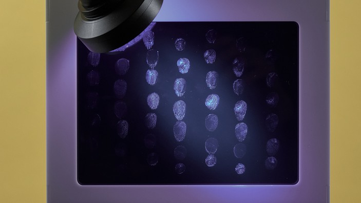
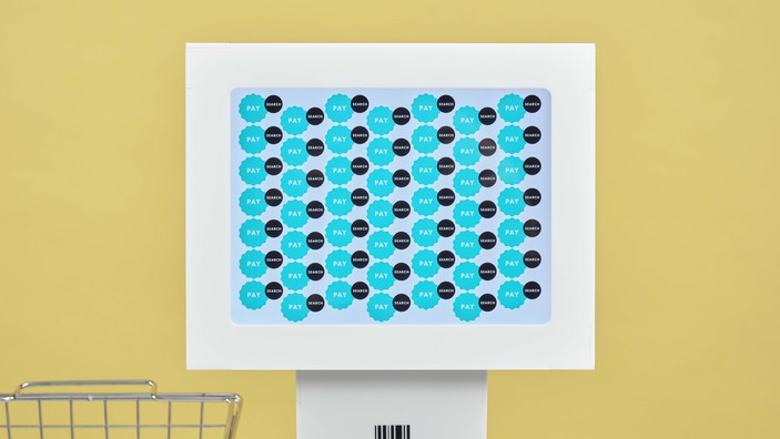
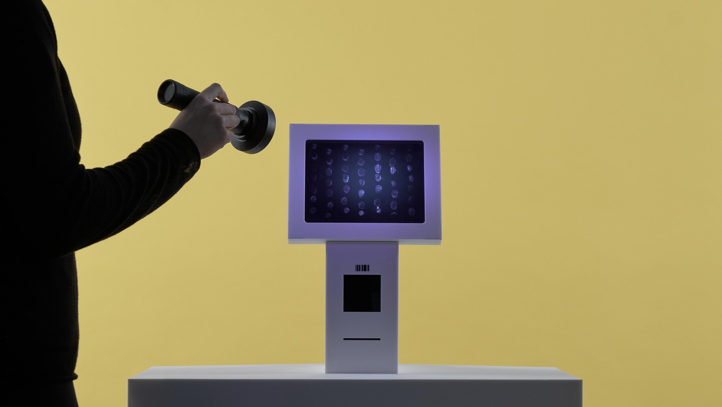
The idea is simple: if someone before you has already pressed an area of the screen the buttons will move around to a clean part of the screen when it’s your turn to use it. Then when it’s someone else's turn the buttons will move again, until the entirety of the screen has been touched by different people. If you could see all of the different fingerprints left behind they would be evenly distributed across the screen, rather than concentrated in one area which is what currently happens.
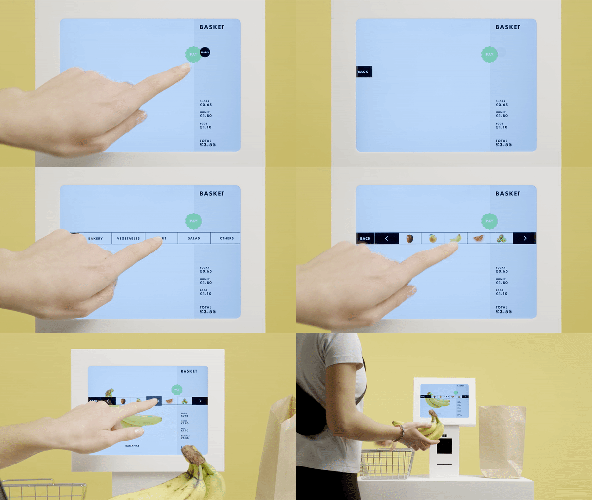
Some purchasing interactions take more than just one tap. For instance, when you are buying loose vegetables, searching for the right fruit, or choosing a pastry from the bakery section. When you need to press the screen several times, the buttons will try their best to occupy a space you have already touched, keeping as much clean space as possible for the next user.
Everything is designed to optimise the use of space, for example when selecting the fruit button, the next most likely option, bananas, will appear right where you just pressed. Then to add or remove bananas to your order the + and - symbols will appear in that same space.
The algorithm cleverly positions the most popular and most frequently used items in the immediate vicinity of your previous touches to encourage minimal screen interaction.
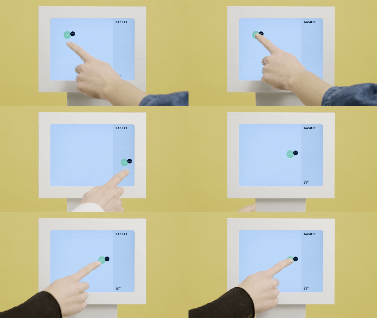
The pay button design graphically resembles a sticker to remind you that it is essentially repositionable to anywhere on the screen. We’ve made it bright green to catch your attention as it might not be in the location you would usually expect.
An interface like this goes against many accessibility rules as people tend to feel more comfortable using familiar interfaces, especially those who find it challenging to interact with them in the first place. We’ve maximised accessibility by anchoring the controls to the pay button and massively decluttering the screen. The idea is what as long as you can locate the pay button, you should be able to find the rest of the commands needed.
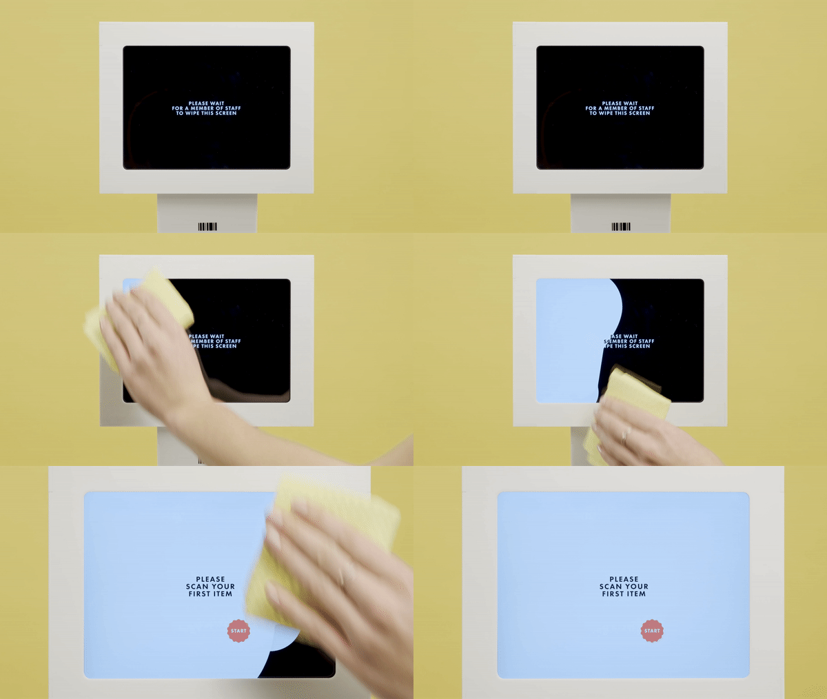
Up to 50 people can use this interface before it needs cleaning, and the system will alert a member of staff to wipe the screen clean. We’ve been testing this and the wonderful thing is that touchscreens can actually detect a wet cloth on them (give it a try!) so the system could ensure that the screen has been wiped completely before resuming normal operation.
Since many interactions at the till can be completed by simply scanning products and pressing 'Pay', we imagine the frequency of cleaning intervals will not slow down the checkout experience drastically, and is a small price to pay for customer and staff safety.

This simple invention could change the way we interact with self-checkouts, ticket machines, and ATMs to create daily safe/clean digital interactions in supermarkets, exhibition spaces, train stations, work and entertainment venues.
We want to share this idea as widely as possible in the hope that companies making human-facing touchscreen interfaces can implement and evolve the idea.
Special thanks to Colin Ross Photography
